SafeNest - An Error Reporting Medical Portal
A system solution meant to address under-reporting while reimagining the traditional OSHA data collection process.
PROJECT SCOPE
-
My Role: UX Researcher, UI Designer, Usability Testing Coordinator
-
Timeline: 8 weeks
-
Toolkit: Figma, Google Suite, Microsoft Teams
-
Methods: Generative Research, Usability Testing, Wireframing + Prototyping


Project Overview
For this project, I worked with a team of designers to develop a responsive solution to reimagine the standard OSHA-regulated form process for error reporting while also addressing underreporting. We honed in on the nursing department employees by creating an incident reporting web portal that would adhere to OSHA guidelines, communicate with administrators, and maintain a friendly UI to quickly allow employees to achieve their objectives.
Problem

Current nursing department's incident reporting system are outdated and inefficient, making it difficult for frontline staff (CNAs, CMAs, LVNs) to report issues quickly or track case progress. This leads to underreported OSHA-mandated incidents, employee frustration, low retention, and system inefficiencies.
Solution

Our portal streamlines error reporting while ensuring OSHA compliance through a user-friendly interface. Key features include a dashboard with case metrics, a simplified form for reporting incidents, and options to update or add case details, promoting transparency and reducing underreporting.
Objectives

-
Design a responsive web portal for non-administrative employees while balancing OSHA-mandated and standard language barriers.
-
Create a dashboard allowing employees to view their case data at a glance.
-
Reimagine the incident report submission process while adhering to the OSHA-301 guidelines.
-
Allow employees to save and submit their forms while allowing them to return to a form or view case status.
Research
Research Questions
Before designing, I wanted to focus on identifying why underreporting is such an issue in the first place, and then understand the current design precedents in place. To help frame my research, I honed in on the following questions:
-
What are the current incident reporting systems in place?
-
What portals can be used as references for the layout and language for a portal geared towards nurses who are not tech-savvy? How is language in the current systems?
-
How do current systems design, present, and follow OSHA guidelines?
-
What additional features do these EHS (Environment, Health, and Safety) software have? How do they organize and simplify the data and available forms?
Research Pain Points
From my research, I found the following pain points:
-
Frontline workers know that incident reporting software exist within their organizations, but there are many learning opportunities from the industry’s current systems. IE Convoluted and Unappealing system design.
-
Numbers are prioritized over incident reduction: employees report incidents, but there’s no action being taken to help prevent future accidents thus reducing motivation to report.
-
Lack of established trust in software and administration.
Target Users
With these pain points identified, and background solidified, we narrowed down the target audience to the following:
-
Certified Nurse Aides (CNA)
-
Certified Medical Aides (CMA)
-
Licensed Vocational Nurses (LVN)
-
Administrators
Further research revealed the following key user considerations we needed to keep in mind as we transitionied into designing:
-
The portal’s system language needs to be familiar to people with various levels of experience with technology.
-
The general design needs to be the same for both nursing employees and administrators so as to facilitate faster form completion and case reviews.
Design Process
Team Brainwriting Session
Prior to conducting our individual research, we decided to join up together and conduct a brainwriting session to get the creative juices flowing and get an idea of what a case portal would look like. Below were some of the ideas we derived:


Concept Map
In order to begin understanding how to organize our system, we began with a concept map that broke down our main, essential components:

User Task Identification
After breaking down our concept map, it was then time to identify and document our user tasks. Our user tasks were broken down into the following:
-
Primary Tasks (core functionality):
-
Submit an Incident Report
-
View Dashboard Navigation
-
-
Secondary Tasks (supporting functionality):
-
View Past Reports (Completed reports)
-
View In-Progress Reports (Have not been sent/submitted to admin)
-
View In-Process Reports (In review)
-
View Processed Reports (Final from Admin)
-
View Notifications
-
Secondary Undergraduate-Specific New Tasks:
-
Select afflicted body part on Human body template (Completed when filling out an incident report).
-
Append additional data, such as audio or video files (Completed when filling out an incident report).
-
Search for a Specific Report
-
Create a Sticky Note
-
-
Sketches
For my sketches, I focused on the essential key details that needed to be illustrated at a quick glance without overwhelming the users.


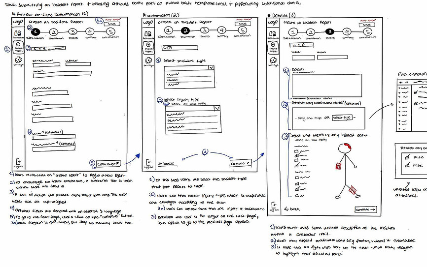


LowFi Wireframes
In my low fidelity iterations, I began experimenting with icon, text, and data placement for both mobile and tablet views. I mainly focused on the best ways to chunk relevant information while simultaneously providing a simple interface for nurses on the go.


Style Guide


HiFi Wireframes


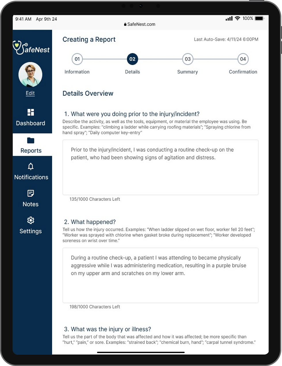
#Homepage/Landing
#Searching for Report 1
#Searching for Report 2
#Searching for Report 3


#Appending Additional Data 1
#Appending Additional Data 2
#Appending Additional Data 3
#Selecting Injury on Diagram
#Filtering Reports


#Viewing Case Comments
#Viewing Case History
Usability Testing
We conducted three testing sessions using the first version of our prototyping with the feedback capture grid method, with one moderator, one observer, and one tester. Afterward, we compiled and evaluated our findings.
Based on our current available tasks, we identified the following key testing objectives:
Primary Task Objectives:
-
Identify whether the dashboard diagrams contained relevant information for the nurses.
-
Observe major touchpoints and any barriers the user encountered during the “Creating an Incident Report,” task flow.
Secondary Tasks Objectives:
-
Note any frustrations and confusion when navigating between the report repository table.
-
Identify if users find the notification’s UI relevant.
-
Note the user experience when following the standard iOS flow of attaching data.
-
Observe how easy it was for users to find the report history and comments buttons when reviewing a “Completed” report.
Additional Extra Tasks/Features Objectives:
-
Note if users can easily create and save a note.
-
Jot down user's ease of filtering between tasks.
-
Note how relevant and useful testers found the ability to select an injuries location on the human diagram.
-
Identify whether users found the pop-up information intuitive for every graph relevant.
Results
-
The Participant really liked the overall look and feel of the app.
-
The logo
-
The color style and data visualization on the dashboard
-
Body template visual
-
-
The participant gave helpful feedback when going through the app. Firstly, when creating the report, the participant got stuck on the drop-down menu for the incident type. There are glitches in the dropdown that we need to fix. For the status bars in the table, participants got confused about what the colors implied. “For the Report Table, the “Finalized” Status bar should either all be green, or distinctions between colors should be noted”. On the notes feature, the participant got confused when adding a note. The icons on the data table and graphs are small and not visible. Lastly, on question 4 on the details page “bold the Optional text because it is not immediately viewable”.
-
-
Participant loved:
-
The color scheme.
-
“How vibrant the graph colors are without being in your face”
-
Selecting the date interaction when creating the report.
-
Prototype of the keyboard.
-
Dropping the files and the body template.
-
The repository table
-
-
Participant got stuck when filling out the report because some of the fields were pre-filled out and the font color suggested it is not editable. “Find a way to make it known it isn’t already typed- in the details because when I get to number 3 I can’t prototype”. The participant also let us know that the pen in the summary section isn’t prototyped, we have to let the user know that it can be edited. The participant repeatedly mentions changing the font size or color to darker “because it looks like filler text, not necessarily what you type in”. On the repository table screen, the participant got confused with the status bars and suggested replacing the graph with the actual word of the status(pending, closed, open). Lastly, the helpful feedback that she mentioned was adding an overlay or a note when clicking the graph on the dashboard. When the user presses on the graph it directly takes to the report cases without any warning, therefore a note saying that the user will be taken to the repository table screen will be better for a friendlier user experience.
-
-
Participants enjoyed our overall look and feel and flow of the user experience.
-
The report cases table is “really impressive and organized”.
-
Participant liked the interactions and elements such as the “continue filling the form” overlay, the auto save on the report, and the information feature in the dropdown of the type of incident.
-
-
When creating the actual report, the participant got stuck when filling out each field. “It is a little bit confusing that some of the fields I can interact, but others I can’t”. That being said all the fields are going to be prototyped properly for the final prototype. When the participant got to the summary page of filling out the report, she got overwhelmed with all of the information. Therefore, instead of adding two columns to the summary, just add one column of information and let the user scroll down. In the notification section, the user kept clicking on each file. That being said, we decided that each notification when clicking will go to that said report or comment for a better user interface. Lastly, the participant had some missteps when adding a note in the notes section, therefore with had to fix the glitch when prototyping.
-
Next Steps
We gained several main takeaways from the feedback of our participants that we would iterate on going forward.
-
The status labeling can be unclear and should provide a more intuitive understanding of the report’s current state.
-
Differentiation between pre-filled information and required fields when creating a report, specifically when completing the information section, is not clear and causes confusion about whether the information can be edited.
-
Finally, the icons and the type size on the dashboard are small and/or unclear. The participants reported wanting to see a bolder color for the iconography, as well as larger heading type and body text for the profile overview field.
Curious to try out the prototype for yourself? Try it now!
Take Aways...
Key Learnings
This project provided a comprehensive opportunity to learn not only how to implement real industry requirements in a responsive environment that collaborates with external data, but also allowed me learn how to best present data visualization and form design.
Future Iterations
Going forward, I’d like to revisit the data visualization landing page and re-touch the style guide. There are still many areas of improvement in these groups, and re-doing some prototyping actions to add more movement to the general flow of the design can make this product more engaging.